
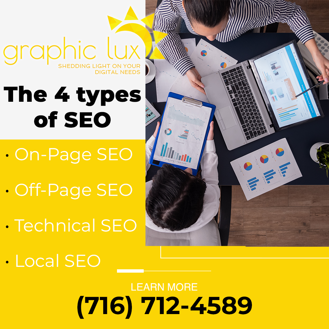
The 4 types of SEO
Search engine optimization (SEO) is one of the most effective digital marketing tactics to improve the Google ranking of a brand website. Graphic Lux shares the various types of SEO that business owners must be aware of as they venture into SEO marketing.
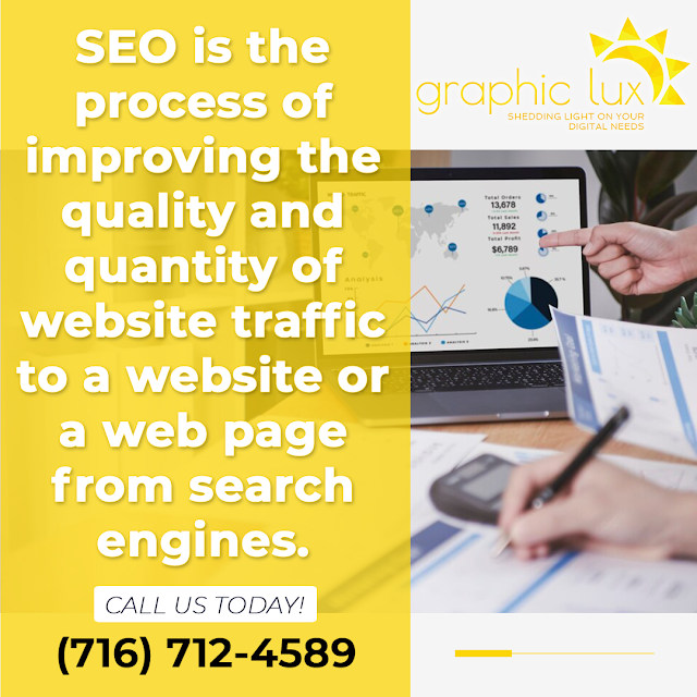
SEO is the process of improving the quality and quantity of website traffic to a website or a web page from search engines. SEO targets unpaid traffic rather than direct traffic or paid traffic.
1. On-Page SEO
On-page SEO tactics or on-site SEO refers to the practice of optimizing web pages to improve a website’s search engine rankings and earn organic traffic. Besides publishing relevant, high-quality content, on-page SEO includes optimizing headlines, keywords, HTML tags (title, meta, and header), and images. Some important practices in on-page SEO include researching keywords including terms and phrases that have high relevance and search volume; optimizing metadata such as meta titles and descriptions; and performing internal linking which involves linking targeted keywords to high-authority pages.
Google’s EAT framework will rank content that has established expertise, authoritativeness, and trustworthiness. On-page SEO helps search engines like Google to understand the content on a site and display relevant results on the top of SERPs.
2. Off-Page SEO
Off-page SEO tactics that take place outside a website. Off-page SEO focuses on creating exposure and trust for a brand to increase website traffic and increase conversion rates. Although link building is considered to be the main off-page tactic, tactics such as content marketing, social media, appearing on podcasts, landing reviews, and building local citations are also important.
Link building is the practice of getting other reputable websites to link back to the brand site in question. Some great practices in link-building tactics include collaborating with relevant industry websites to publish the articles and guest blogging for reputable websites that are considered industry experts. In both cases, the website will link back to the brand website, boosting its credibility. Notably, this link building must be done at a gradual pace, especially if it is a young website because Google analyses not only the quality but also the speed at which a backlink profile is created.
Moreover, make sure that the backlinks are “dofollow” links, which are a descriptor of links describing that search engines crawl them and count them as votes of quality.
3. Technical SEO
Technical SEO tactics refers to improving the technical aspects of a website in order to increase the ranking of its pages in the search engines. Some of the main pillars of technical SEO are making a website faster, easier to crawl, and understandable for search engines. Besides a faster load speed, a website must be secure and mobile-friendly with a concise site structure that is easy to navigate.
4. Local SEO
Local SEO tactics optimize a website for a specific local area. It’s all about increasing a brand’s online presence in its community and promoting its products or services to local customers. It is highly targeted SEO.
By creating a Google My Business profile, brands ensure that their local business shows up on the SERPs. The search engine looks at proximity, relevance, and prominence based on the user’s search query.
To optimize Google My Business, local businesses should create and verify a Google My Business page, use Google Posts within their account, encourage customers to share reviews online, and respond authentically to reviews, specifying the location.
Why Graphic Lux?
Graphic Lux offers an array of digital services to clients across Buffalo, NY. It is a one-stop-shop for a business’ digital needs:
- WordPress Website design, consultation, maintenance, and SEO: Graphic Lux specializes in WordPress website design and has over 12 years of experience. It can help build a WordPress custom theme from scratch or take a pre-existing theme and customize it as per client needs. The team also keeps the site running smoothly, without any downtime.
- Hosting: The team offers the assurance that a website will be online and available for customers and visitors with all its data intact.
- Brand building: The team can help create a strong brand identity for the client by optimizing the content using visual devices.
- Dedicated support: With years of experience and unrivaled expertise the Graphic Lux support team will understand the client’s concerns and goals to give them peace of mind.
- Responsive web design: Graphic Lux is on the cutting edge of designing and delivering responsive web and mobile apps. Its solutions decrease time to market and reduce maintenance costs.
For more information, email [email protected] or call at (716) 712-4589.

Contact Information:Graphic Lux
1 W Seneca St Suite 29-M18
Buffalo, NY 14203
United States
Matthew Lux
(716) 712-4589
https://graphiclux.com