10 Web Design Definitions You Need to Know
When looking for a new site or even a new redesign, you as a client may feel alienated by all the “techie” terms that are being used today. Below are 10 web design definitions you will need to know.
404 Page
A 404 page is the page you come to when you have an old, or bad link within a site. Each site should have it’s own custom 404 page that allows the user to find an easy way to navigation or search the site for the content they need.
301 Permanent Redirect
A 301 permanent redirect page is often used when a website is updated and the content is no longer at the same URL. Let’s say you had a website up online for years. Each of your pages should have been indexed by a major search engine. When you update your site and the URL structure changes those indexed pages are no longer correct and when a user clicks on those old indexed pages it should at least come to a 404 page (see above), but ideally a 301 redirect to the new URL for the same content.
Breadcrumbs
Breadcrumbs are crucial on a website if you have multiple layers of pages and sub-pages. These are the little menu items usually above the content that help navigate to previous pages/sections of a site.
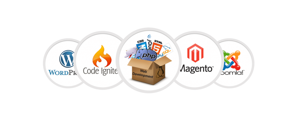
CMS
CMS stands for content management system. Most websites developed today will have a CMS integrated allowing the client/owner of the site, to update content, images, etc… The major CMS’s today are W0rdpress, Joomla, and Drupal.
CSS
CSS stands for Cascading Style Sheets. Basically CSS is used by web developers to stylize a site. For example if you have a navigation link on your site that is white and you want it to be a grey color the web developer would use css to update this.
Code example – Before
.menu li a {
color: #fff
}
Code example – After
.menu li a {
color: #ccc
}
Responsive Design
Responsive web design (RWD) is an approach to web design aimed at crafting sites to provide an optimal viewing experience—easy reading and navigation with a minimum of resizing, panning, and scrolling—across a wide range of devices (from desktop computer monitors to mobile phones).
Retina Ready
In the most basic of terms, it means a high definition display. Also, Apple products are not excusive to this type of display. Retina Display is simply Apple’s term for is but other phones, tablets and monitors too have higher quality displays. But, because these displays are being widely implemented and used, it is more than ever important to create websites and apps that support these displays.
SEO
SEO stands for Search engine optimization. SEO is the process of affecting the visibility of a website or a web page in a search engine’s “natural” or un-paid (“organic”) search results. In general, the earlier (or higher ranked on the search results page), and more frequently a site appears in the search results list, the more visitors it will receive from the search engine’s users. SEO may target different kinds of search, including image search, local search, video search, academic search, news search and industry-specific vertical search engines.
SMM
Social media marketing is the process of gaining website traffic or attention through social media sites.
WYSIWYG
WYSIWYG stands for What You See Is What You Get. WYSIWYG is the editor that you use to update content in you CMS (Content Management System).
Knowing the terms above will help you understand all the “geek” speak that may be going on when reviewing your website needs with your web design & development company.
